The more I look at it and tinker with it, the more I have come to like this first Soccer Therapy logo.
It certainly isn’t original in one sense. It seems at least 1 in every 3 MLS fans uses some altered version of this logo for their profile pic on Twitter (see more about this in my MLS Good, Bad and Ugly piece) . I went ahead and followed their lead, going the easy but stale route. However, I added a few tasteful Texas twists.
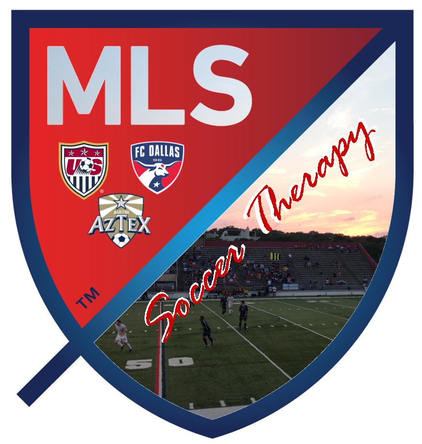
“1st Half”
I read somewhere that the three stars MLS’ new logo represent club, country and community. So I took the three teams I support, my three truly beloved clubs, and replaced the stars with each of their shields. It is convenient that I support three clubs, but my reasons for supporting each club align perfectly with each star in MLS’ logo. The Aztex are my hometown club and play just a few miles from where I grew up. FC Dallas is the be-all and end-all for me in soccer – My Club. And of course, the Stars and Stripes will always be number one.
“2nd Half”
I took the blank white slate that MLS so wisely offered to their supporters (see Good, Bad and Ugly article) and filled it with a beautiful ATX sunset and a 4th-division soccer match being played on a high school football field. But, it’s still soccer being played in Austin’s “venerable” House Park. The match took place during the Aztex PDL championship season, and, if you look hard enough, you can see the flag, drum and 20 or so folks representing Eberly’s Army (the Aztex lone supporters group as far as I know).

So there you have it, the new logo twisted into a nice little depiction of my soccer happy place. Maybe I’ll remove that stupid kick stand now that I think about it – MLS’ silly logo breakdown attempts to explain the meaning of that damn kick stand. From MLSsoccer.com (I’ve highlighted the key parts referring to the kick stand):
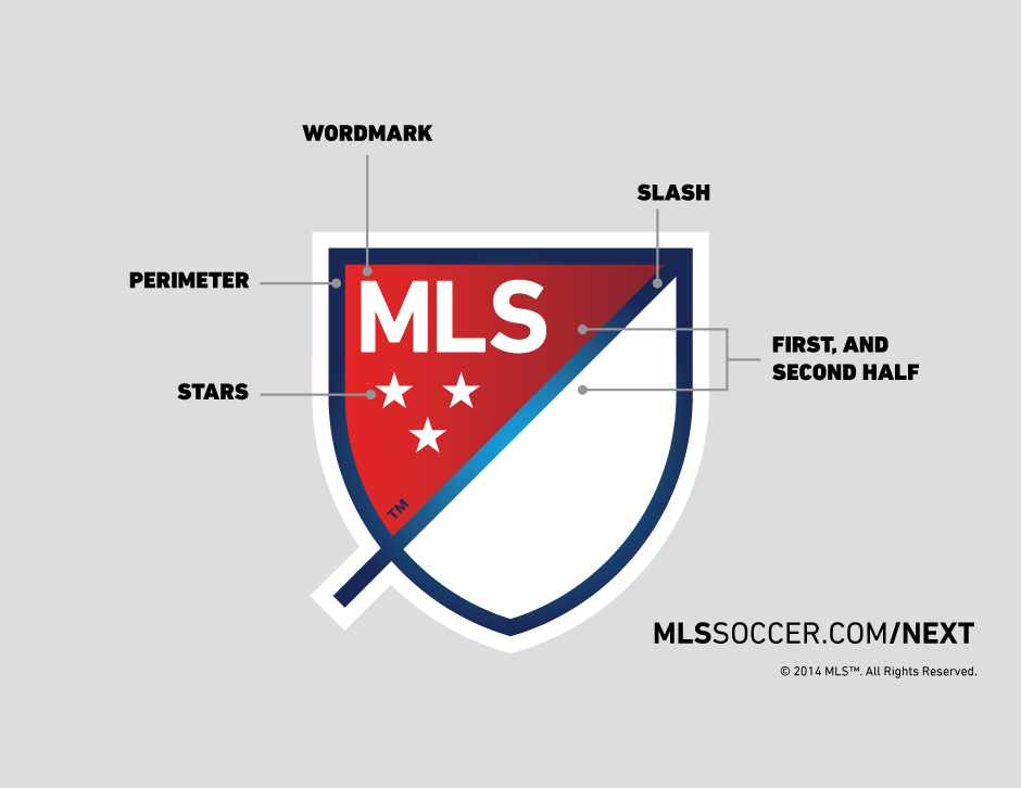
“SLASH: The slash refers to soccer’s speed and energy. The slash begins outside the perimeter and drives upward at a 45-degree angle to illustrate both the nonstop nature of our game and the rising trajectory of our league. It bisects the crest to create a “first half” and “second half.”
As far as I can surmise, the kick stand represents the “nonstop nature of (soccer).” Are you f***ing serious, MLS? Whatever, this is my logo now and I won’t be trying to incorporate any sillyness. Besides, we don’t need no stinking kick stands at Soccer Therapy. Up top is the cause I truly care about and really want to believe in, MLS. Below are the three clubs that make up my soccer fan hood. And below that is a picture taken on a great soccer night in ATX with great people.
I encourage any and all readers to offer feedback on the new logo, however minor, critical or insensitive.
 This might be a weird thing to say, but nothing does it for me quite like a well done TV commercial. I’ve enjoyed television ads so much (the good ones anyway) in my life that I even decided to study the subject of advertising when settling on a major in college. This wasn’t a smart move on my part as I quickly learned, upon studying the subject and looking beyond the catchy TV ads, that there are so many other not-so-cool things about the advertising profession in the modern world.